Uptime.com
Uptime.com
Uptime.com
A website performance monitoring web application for Site Reliability Engineers.
A website performance monitoring web application for Site Reliability Engineers.
A website performance monitoring web application for Site Reliability Engineers.
SaaS Product Design UX Research
SaaS Product Design UX Research
SaaS Product Design UX Research

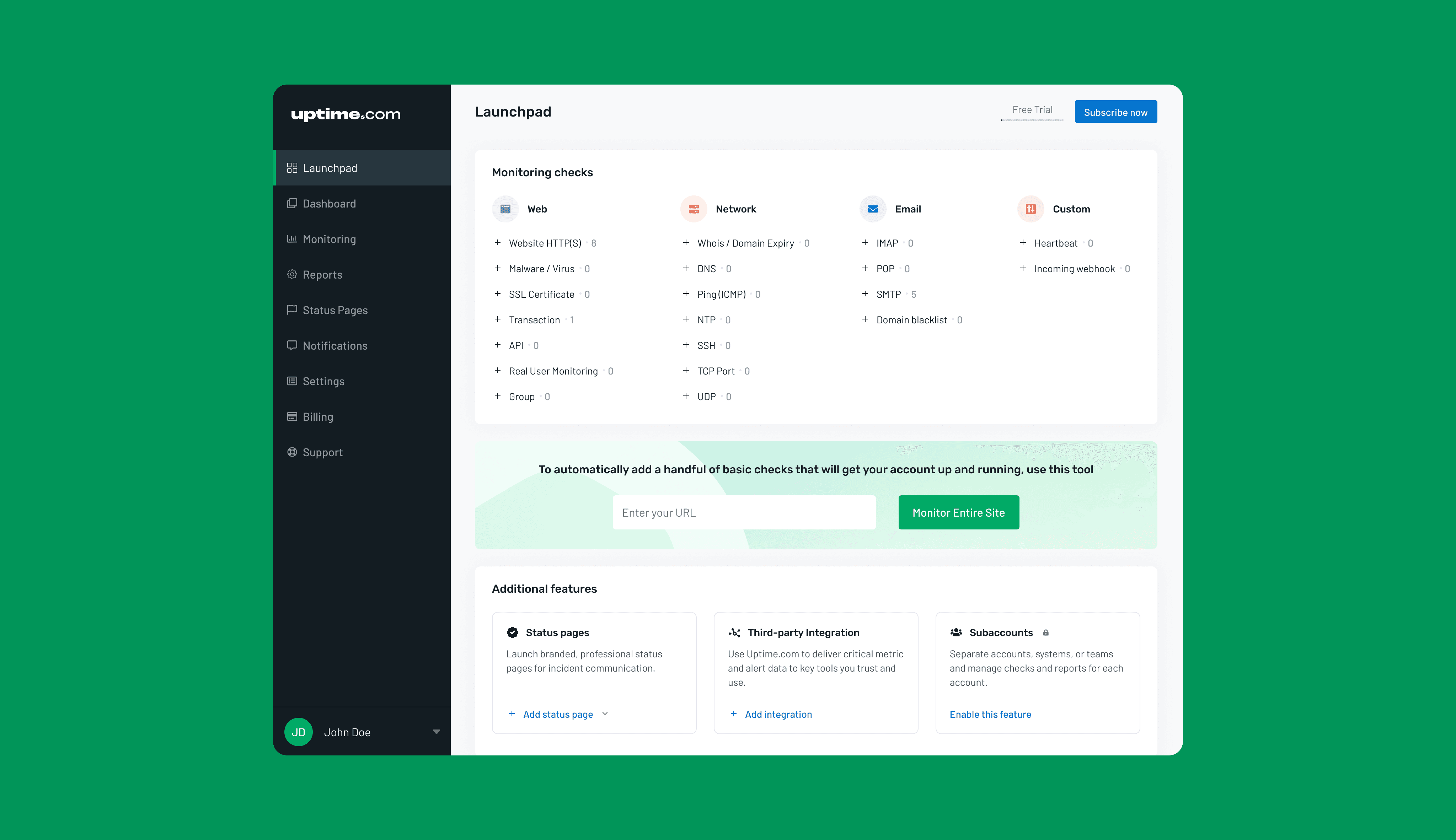
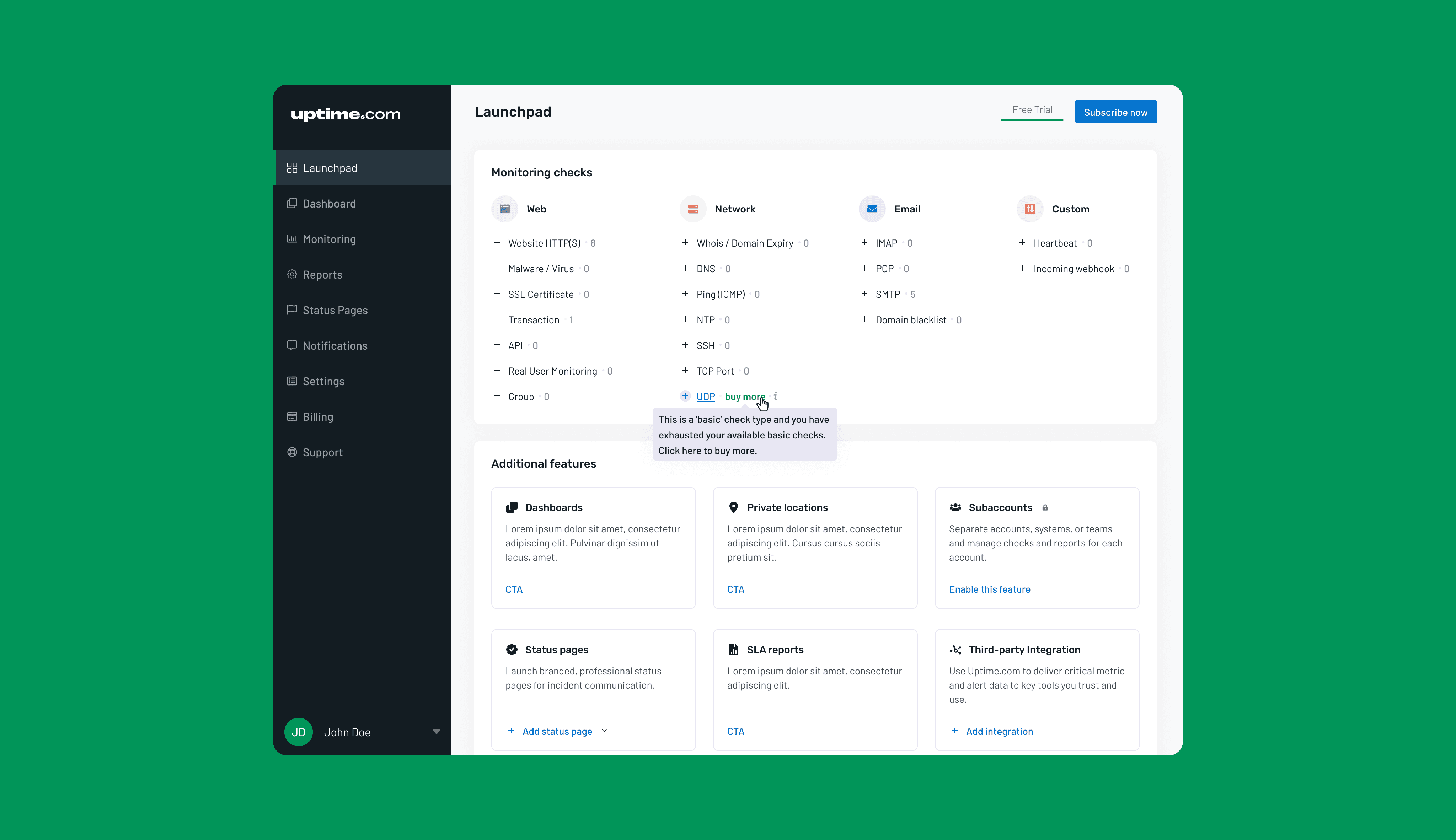
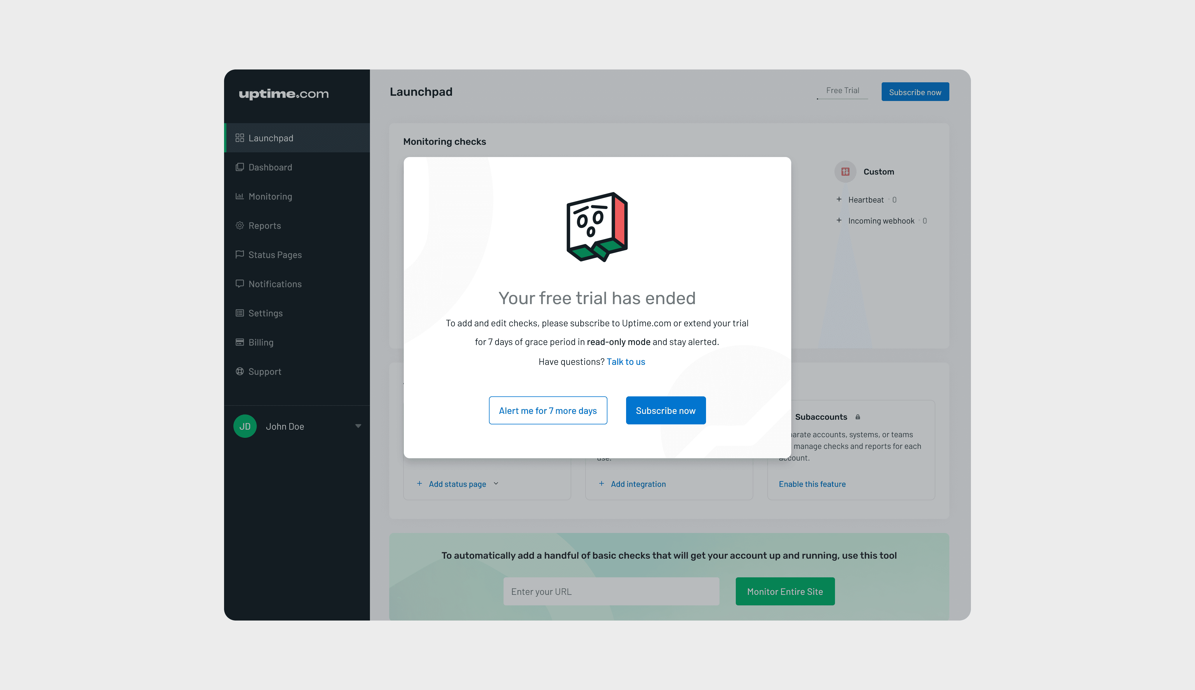
Design of a new feature: Launchpad
On the Uptime platform, Site Reliability Engineers create something known as monitoring ‘checks’ for observing their systems.
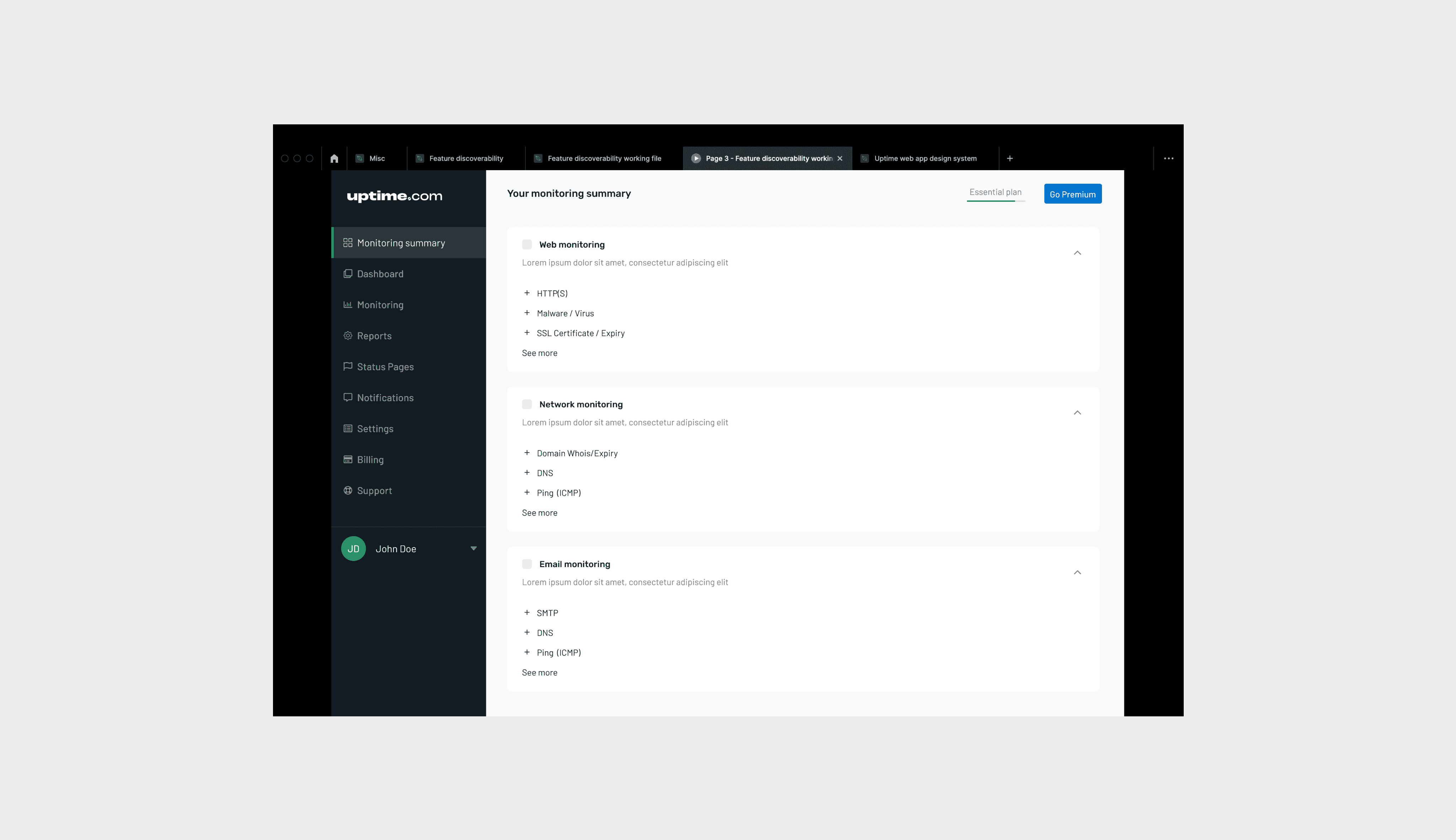
Customers were routinely unaware of features
It was concluded over time through research that many offerings of the app went undiscovered or underutilised by customers’ teams and as a result caused concerns over justifying pricing for the company.
It was important to find a way to easily find all offerings and track usage
We decided to create a touchpoint where it would be easy to get a view of all monitoring checks that can be created as well as enable creation and tracking of check types. This space was also designed to show additional features with one-click access.
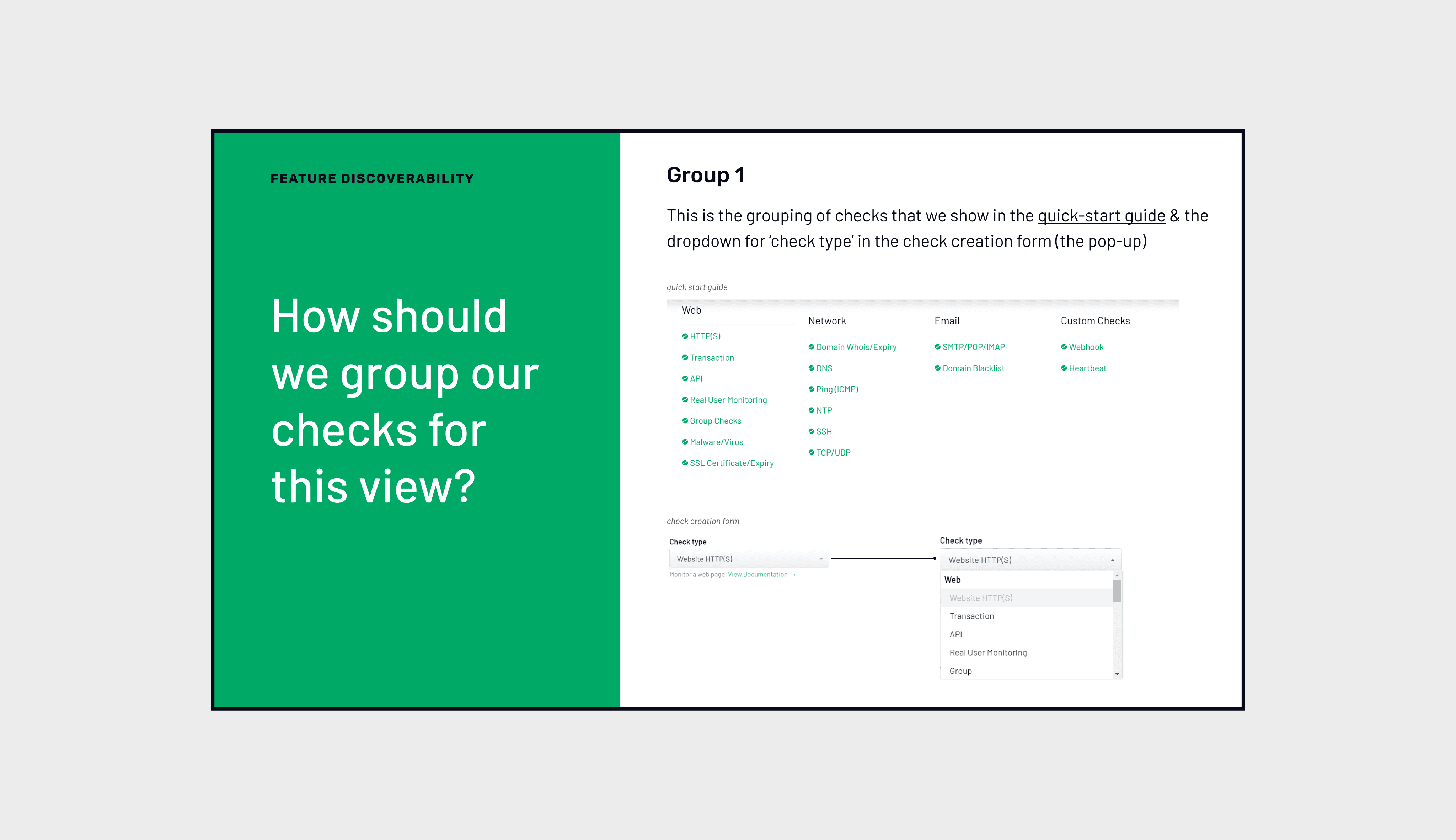
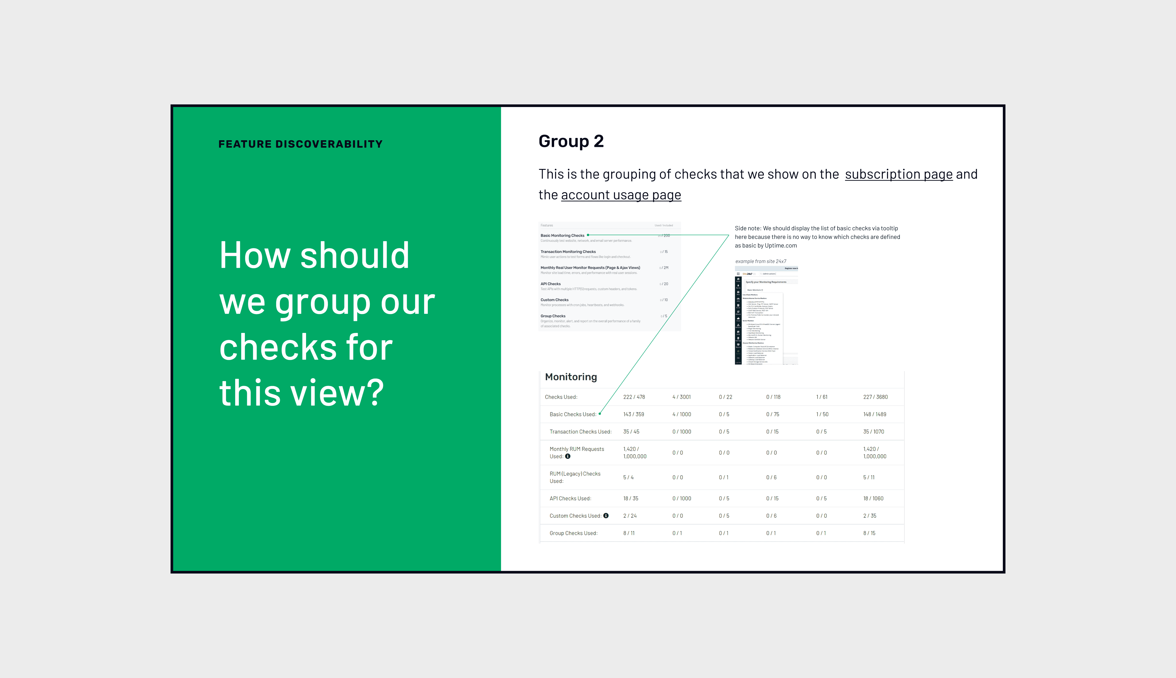
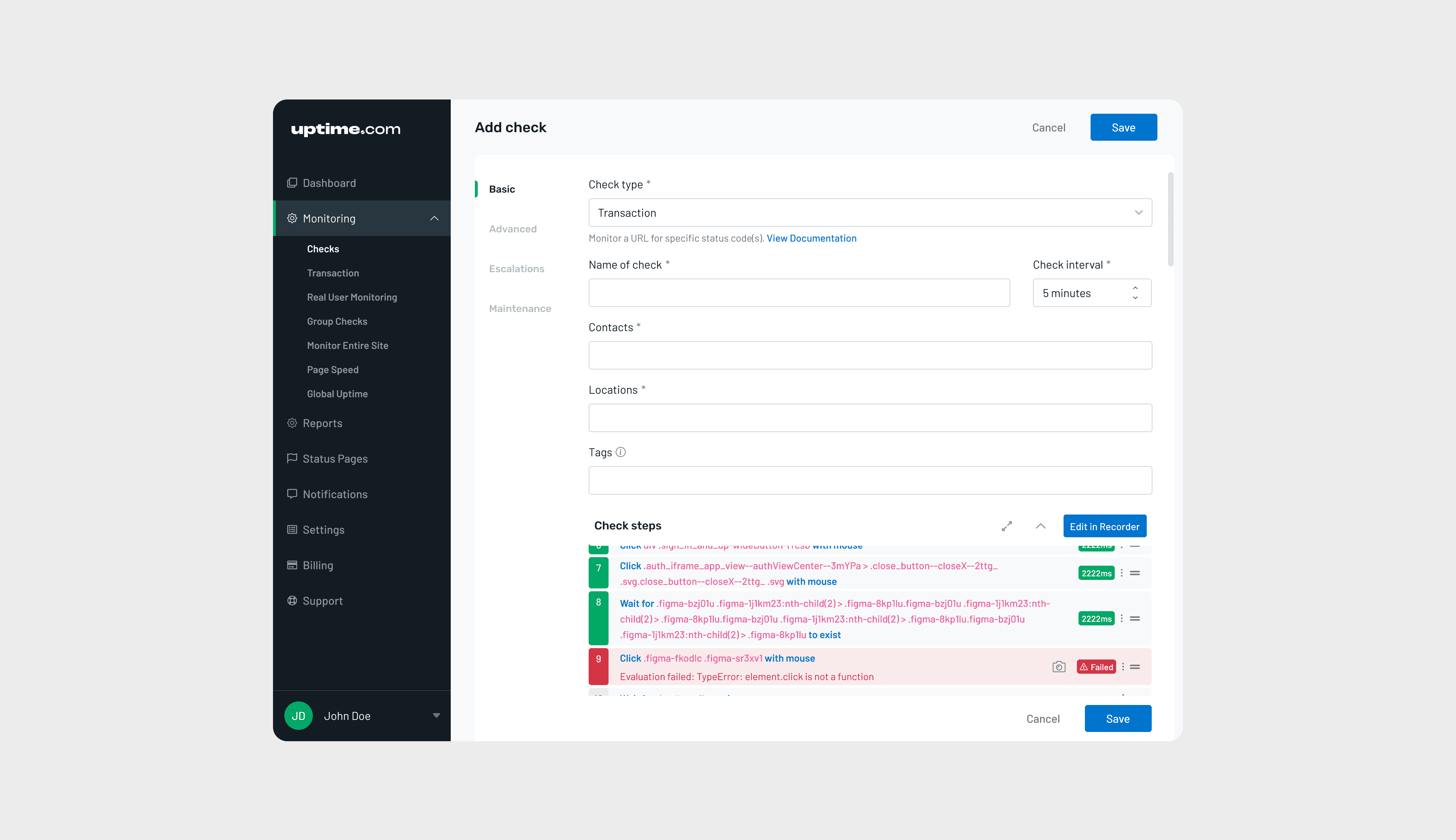
Early brainstorming and wireframes
My early wireframes consisted of card-based design structures for each category of checks. These were interactive prototypes that the internal stakeholders could navigate and evaluate the workflow.

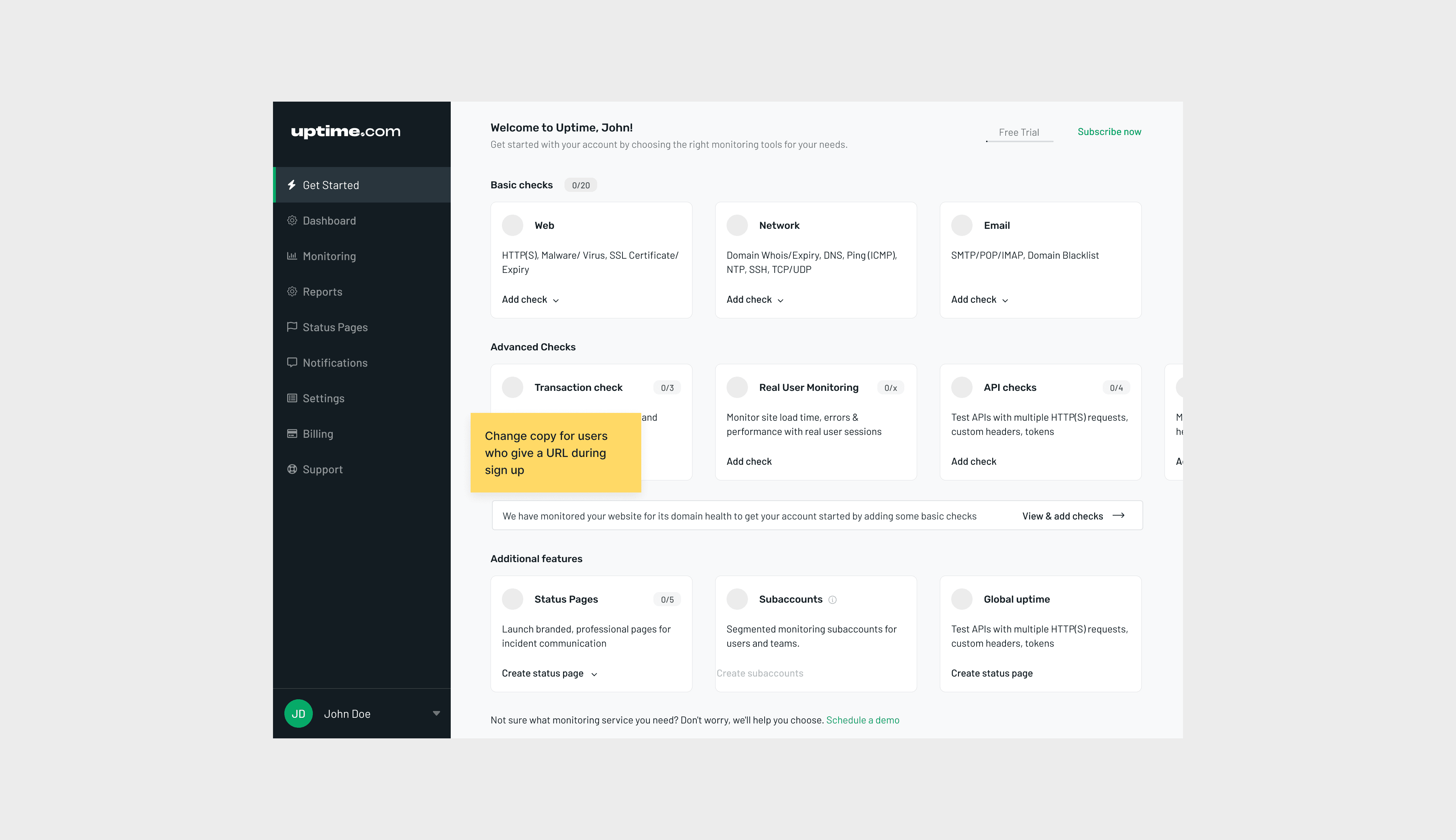

Usability testing
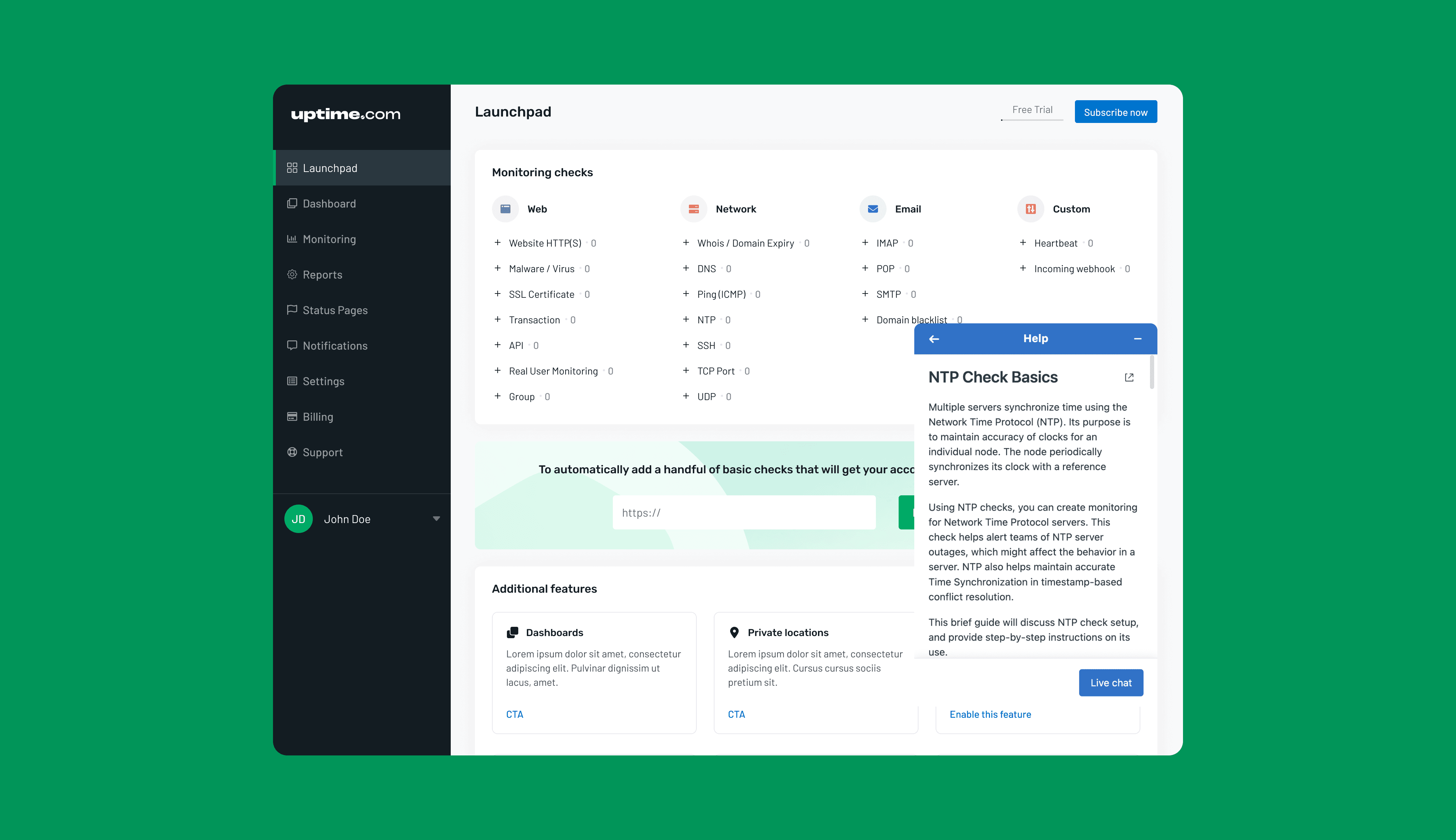
After conducting usability testing with a mix of old and new users, I realised that it was hard for them to remember what each type of check was. Therefore, I added the ‘i’ button for opening up the information widget that provided help with understanding check types.
I also realised that it was important to provide a one-click entry into trying out new checks and other features.
Users reiterated that having a separate band for ‘Monitor entire site’ was very helpful to jumpstart new accounts with basic checks.
These changes proved to be very helpful in the second round of usability testing.
Team structure
As a solo designer on the team, I worked closely with the founders, CEO, development team and customer success team. All respective stakeholders were involved through the process from brainstorming & wireframing to development & testing.
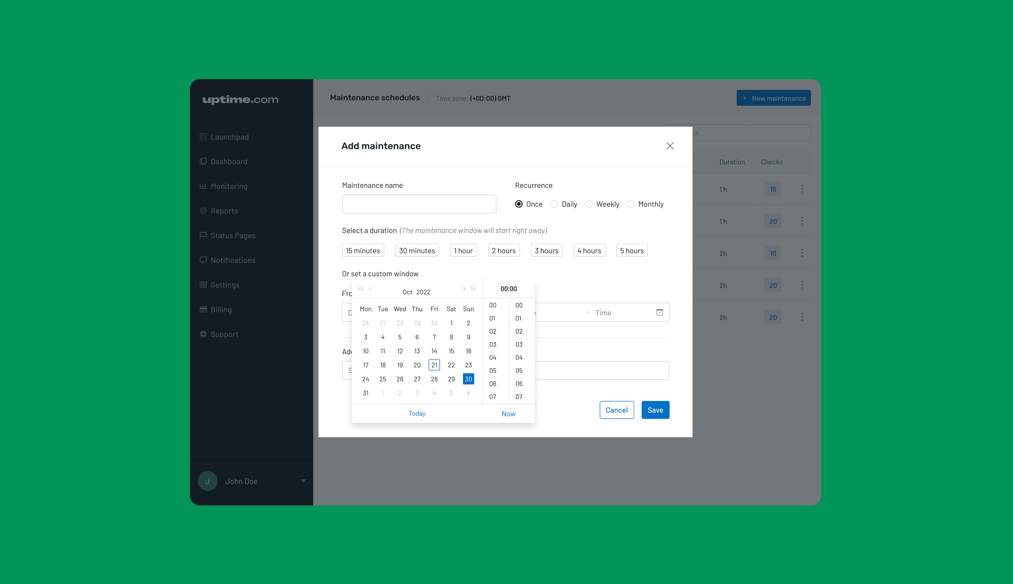
Below is the design for a new feature for setting one-off maintenance windows for checks and improved management of recurring windows.
Maintenance windows are difficult to manage because of the large number of monitoring checks created by one team. It is also inefficient to have to create each check and then apply windows to them.
This design focuses on showing a view of all maintenance windows and the ability to apply windows during check creation.
Having a page where all windows can be viewed and managed simplifies check maintenance. The design also keeps in mind that selecting maintenance while creating a check is very useful in terms of keeping context in mind during check creation.

Below are snapshots of some minor feature improvements that I led.

© twoadesign 2023
Design of a new feature: Launchpad
On the Uptime platform, Site Reliability Engineers create something known as monitoring ‘checks’ for observing their systems.
Customers were routinely unaware of features
It was concluded over time through research that many offerings of the app went undiscovered or underutilised by customers’ teams and as a result caused concerns over justifying pricing for the company.
It was important to find a way to easily find all offerings and track usage
We decided to create a touchpoint where it would be easy to get a view of all monitoring checks that can be created as well as enable creation and tracking of check types. This space was also designed to show additional features with one-click access.
Early brainstorming and wireframes
My early wireframes consisted of card-based design structures for each category of checks. These were interactive prototypes that the internal stakeholders could navigate and evaluate the workflow.
Usability testing
After conducting usability testing with a mix of old and new users, I realised that it was hard for them to remember what each type of check was. Therefore, I added the ‘i’ button for opening up the information widget that provided help with understanding check types.
I also realised that it was important to provide a one-click entry into trying out new checks and other features.
Users reiterated that having a separate band for ‘Monitor entire site’ was very helpful to jumpstart new accounts with basic checks.
These changes proved to be very helpful in the second round of usability testing.
Team structure
As a solo designer on the team, I worked closely with the founders, CEO, development team and customer success team. All respective stakeholders were involved through the process from brainstorming & wireframing to development & testing.
Below is the design for a new feature for setting one-off maintenance windows for checks and improved management of recurring windows.
Maintenance windows are difficult to manage because of the large number of monitoring checks created by one team. It is also inefficient to have to create each check and then apply windows to them.
This design focuses on showing a view of all maintenance windows and the ability to apply windows during check creation.
Having a page where all windows can be viewed and managed simplifies check maintenance. The design also keeps in mind that selecting maintenance while creating a check is very useful in terms of keeping context in mind during check creation.
Below are snapshots of some minor feature improvements that I led.
© twoadesign 2023